
Website traffic is great. But it’s just the first step.
Your website needs to systematically convert visitors into leads or customers — if it’s not doing that at a rate that can support your business, then what’s even the point of having a website?
There are a ton of different factors that can affect your website’s conversion rate, from the quality of your content to the design of your landing pages. But if you’re looking for some quick and easy ways to give your conversion rate a boost, we’ll give you 11 things to try in this article.
What is Conversion Rate Optimization?
Conversion rate optimization (CRO) is the practice of designing pages and creating content with the express purpose of getting users to take a specific action.
There are a number of different actions you might want visitors to take, but the most common goal is to get them to convert into leads or customers.
That’s why conversion rate optimization is often simply referred to as lead generation.
Whatever you want visitors to do, the goal of conversion rate optimization is to get more people to do it.
Why is Conversion Rate Optimization Important?
A website’s conversion rate is one of the most important metrics to track because it directly impacts your bottom line.
If you’re not converting visitors into leads or customers, then all the traffic in the world won’t do you any good.
Conversion rate optimization is important because it allows you to get more value out of the traffic you’re already getting.
It’s a way to make your marketing more efficient, so you can get more leads and customers with the same amount of time or money.
The Importance of Testing For Conversion Rate Optimization
One of the most important aspects of conversion rate optimization is testing.
You should always be testing different elements on your pages to see what leads to more conversions.
That could mean testing different headlines, calls-to-action, images, or anything else that you think might impact whether or not visitors convert.
The only way to know for sure what works best is to test different versions against each other and see which one performs better.
We’re going to give you a lot of different ideas for things you could test.
But here’s the truth: the same thing doesn’t always work for different websites, offers, or services.
What works for one company might not work for another.
The only way to know for sure what will work best for your business is to test it out for yourself.
Here’s The Hard Truth Behind Your Website’s Sub-Par Performance
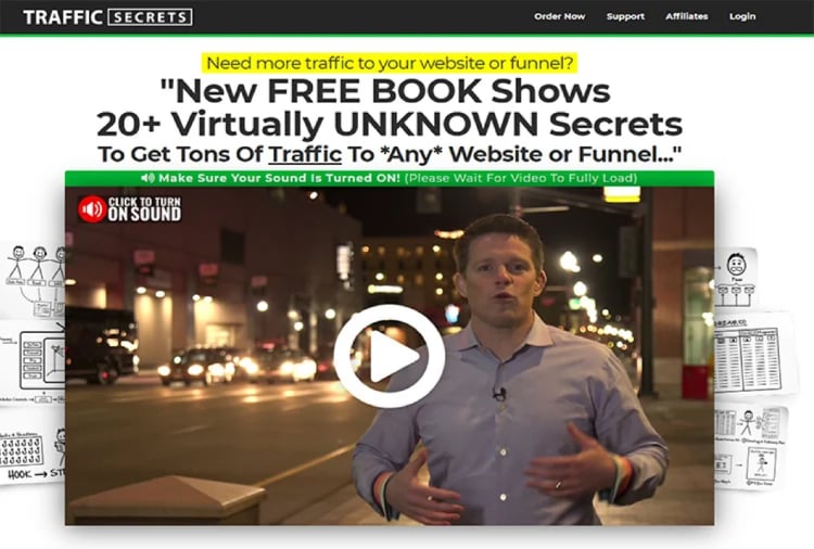
1. Add a Sales Funnel
One problem you might have with your website’s conversion rate… is your website itself.
What do I mean?
Most websites do diddly-squat for driving real results. Unless you’re an established business with a well-known brand, you don’t need a website… you need a sales funnel.
What’s the difference?
Well, let’s look at how a website works.
People come to your website, they look around aimlessly, and then they decide on their own what action they’re going to take. And most of them leave.
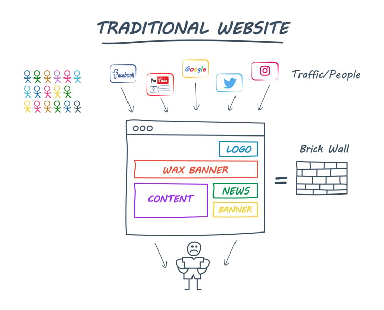
The reason that most website visitors leave is because they haven’t been guided.
They’ve been shown a ton of stuff — some content, some products, some ads, some news, and an About Page — but they haven’t been clearly instructed as to what action they should take.
It’s sort of like if someone comes into your brick-and-mortar store… and you don’t greet them, you don’t ask them if you can help, you don’t guide them.
That’s where a sales funnel is different.
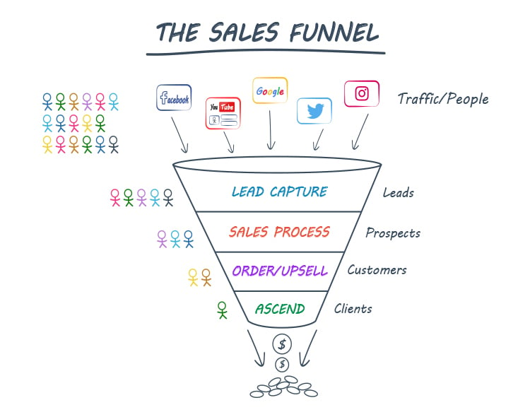
Having a sales funnel instead of a website is like having your very best salesperson guide each prospect to conversion.
Except it all happens online… automatically.
Here’s how it works.
Using a sales funnel, each page is intentionally crafted to guide the visitor to the next page and the next action… eventually leading to conversion!
For example…
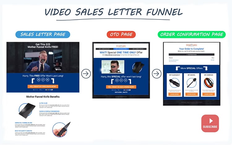
And sales funnels get wayyy higher conversion rates than websites.
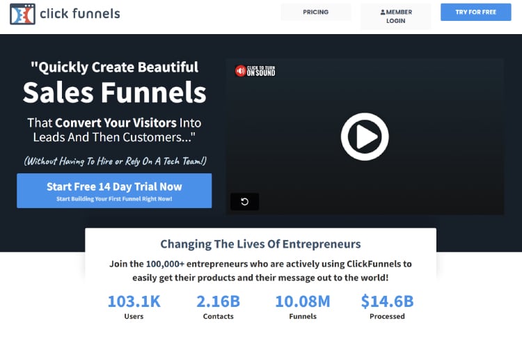
In fact, at ClickFunnels, we have helped thousands of online entrepreneurs build winning sales funnels.
Here’s one story of how Jaime Cross used ClickFunnels to build a thriving eCommerce business.
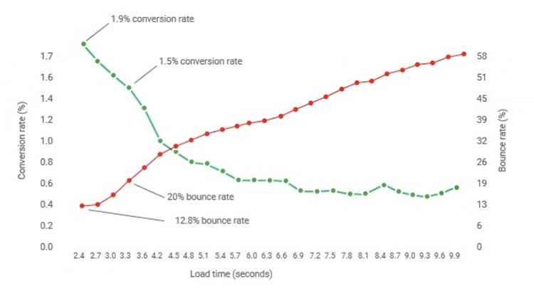
2. Make it Load Faster
Slow loading times are one of the surest ways to lose visitors before they even have a chance to see what you have to offer. In fact, research shows that a one-second delay in page load time can result in a 7% decrease in conversion rates.
There are a number of different things you can do to speed up your site’s load time, from optimizing your images to using a content delivery network.
Here’s a quick list of some ways to improve your website’s load speed:
- Use a content delivery network
- Optimize your images
- Minimize HTTP requests
- Use browser caching
- Reduce the number of plugins you’re using
- Compress your CSS and JavaScript files
Not sure how fast your website loads?
Enter your URL over here — that tool will tell you how fast your website loads, what’s slowing it down, and even how to fix it.
3. Trim The Fat
Whether it’s words, images, or CTAs… remove anything that doesn’t contribute to moving your visitors closer to becoming a customer.
Remember: every element on your website is fighting for attention, so it needs to serve a purpose or it should be gone.
Ask yourselves these questions about every element of your website…
- Is this building rapport?
- Is it providing value?
- Is it pointing people toward what I want them to do?
If it’s not doing any of those three things, then get rid of it.
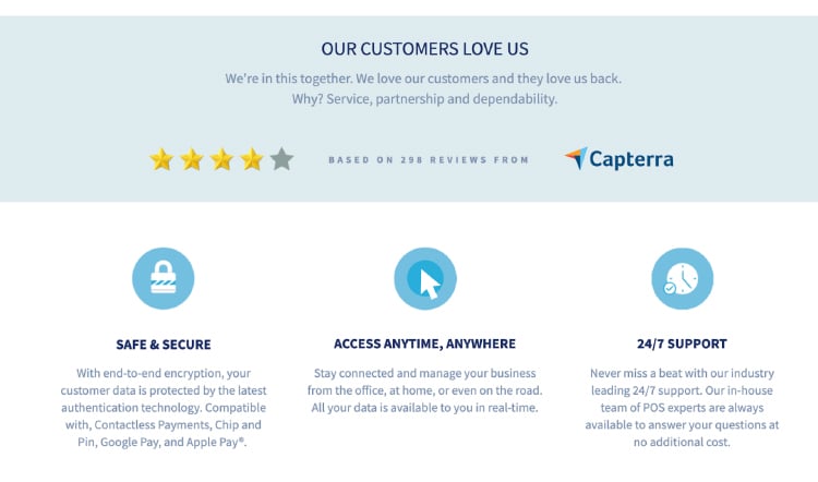
Here’s a great example of a landing page without any fat…
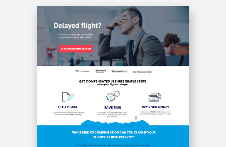
One trick to cut the fat from your website is by using what’s called “white space” — intentionally leaving empty space around certain elements to make them more noticeable.
In addition to making your website look cleaner and more organized, white space can actually help guide people’s eyes to specific parts of the page, which is great for directing their attention where you want it to go.
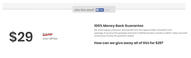
4. Use Scarcity & Urgency
People are procrastinators.
And one of the most tried and proven ways to increase a website’s (or landing page’s) conversion rate is by adding urgency or scarcity.
Here’s one example (from CXL) where adding urgency increased conversions by 332%.
Before…
After…
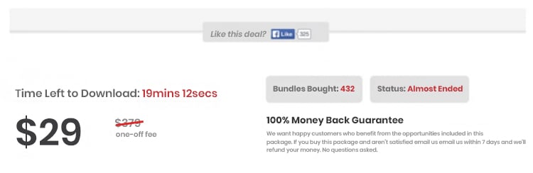
It’s a simple change that had a huge impact.
Urgency works because it creates a sense of FOMO (fear of missing out) in people, which leads them to take action before it’s too late.
Scarcity is similar but instead of focusing on the time element, it highlights how few items or spots are left.
If you want people to take action right now, then urgency and scarcity are your friends.
5. Get Rid of Menu Navigation
When websites were being born, someone thought it was a good idea to include links on the “homepage” of their website to all the other parts of their website.
This main menu navigation has become commonplace.
But why?
This ability for people to navigate wherever they want often does more harm than good for entrepreneurs trying to build an online business.
You don’t want people to browse, you want them to convert.
And navigation often hurts conversion.
In one study (from VWO), a company doubled its conversion rate just by removing its navigation menu.
Before…
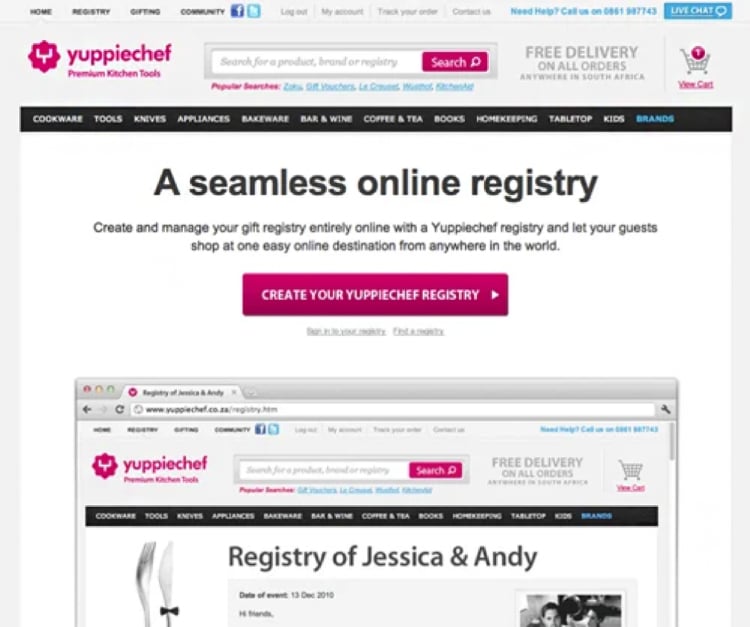
After…
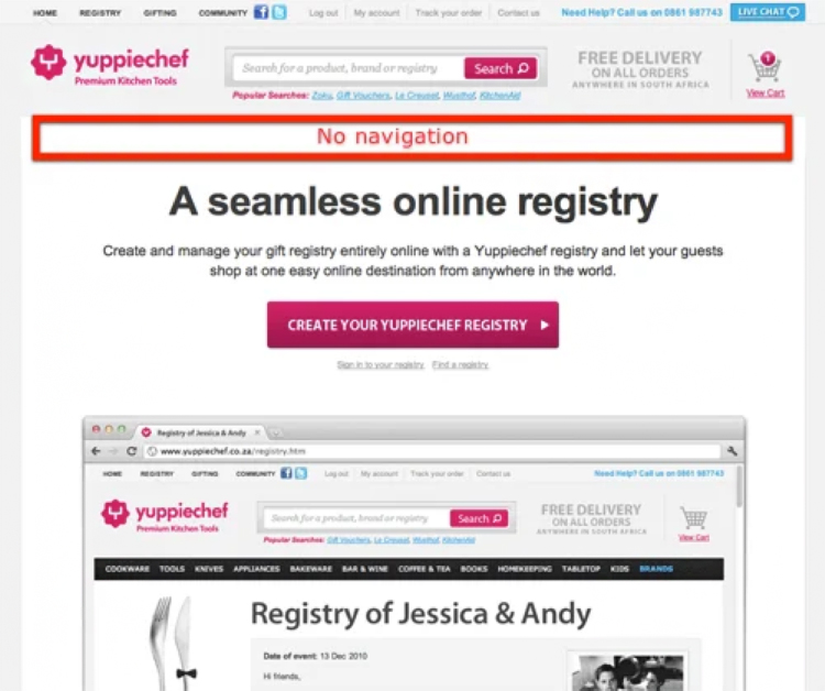
This is why, on our website, we also have virtually no navigation — we want people to use our software… it’d be silly (and extremely distracting) to point them toward all of the online assets we offer.
Instead of giving visitors a ton of different options, focus on leading them down a specific path (i.e. your sales funnel).
6. Leverage Social Proof
People are social creatures.
We’re constantly looking to others for guidance on what we should do, what we should buy, and who we should trust.
And one of the quickest ways to build rapport with someone is by showing that other people just like them have had a positive experience with you.
This is called social proof and it’s one of the most powerful ways to increase website conversions.
There are all sorts of ways you can leverage social proof on your website:
- Customer testimonials
- Video case studies
- Reviews
- “As Seen On” logos from popular publications
The list goes on.
The important thing to remember is that most people don’t want to be the first — they want to take action… but only after seeing that other people who’ve taken action got the same results, they’re looking for.
Social proof is how you reassure your website visitors that your products or processes really do work.
7. Simplify Your Forms
Complex forms are a common website conversion killer.
The more fields you ask people to fill out, the less likely they are to actually finish filling it out — this is true for lead magnets and for sales forms.
Whenever possible, you should simplify your forms and only ask for the bare minimum amount of information that’s absolutely necessary.
In general, shorter forms convert better than longer forms.
And if you can find a way to eliminate a form altogether (perhaps by leveraging social logins), that’s even better.
OR… if you absolutely need to have a complex form, then consider using a multi-step form like this…
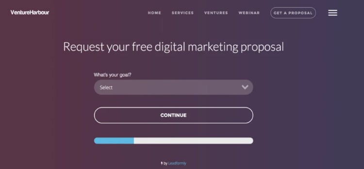
Venture Harbour increased conversions by 743% by switching from a one-page form to the above multi-step form.
8. Use Exit-Intent Pop-Ups
There’s a reason pop-ups get a bad rap.
Most of the time, they’re utilized in an intrusive way that makes for a terrible user experience.
But if used correctly, pop-ups can actually be quite effective at increasing conversions.
The key is to make sure your pop-ups are:
- Relevant to the user — Whatever you offer with the pop-up should be ]relevant to the visitor and what they’re hoping to receive.
- Triggered at the right time — The pop-up should only appear after the user has been on your website for a certain amount of time or they’ve taken a specific action (like trying to leave your website). Exit-intent pop-ups are usually a good idea.
- Not intrusive — The pop-up shouldn’t be so obtrusive that it completely takes over the visitor’s experience.
Here’s a great example of an exit-intent pop-up from Digital Marketer…
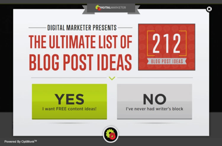
Their bounce rate decreased from 66.46% to 53.39%. And their average time on site also increased by 54%.
The best part?
Digital Marketer generated an extra 2,689 leads from this pop-up shortly after they implemented it.
Makes you wonder…
How many leads are you losing because you don’t have an exit-intent pop-up?
Here’s The Hard Truth Behind Your Website’s Sub-Par Performance
9. Use Heatmaps & Clickmaps
If you’re not using heatmaps and clickmaps to see where people are paying the most attention on your website (and what they’re clicking on), you’re missing out.
Knowing where people are looking (and what’s catching their eye) is critical for increasing conversions because it allows you to fine-tune your website design and make sure you’re putting the most important elements in the places where people will actually see them.
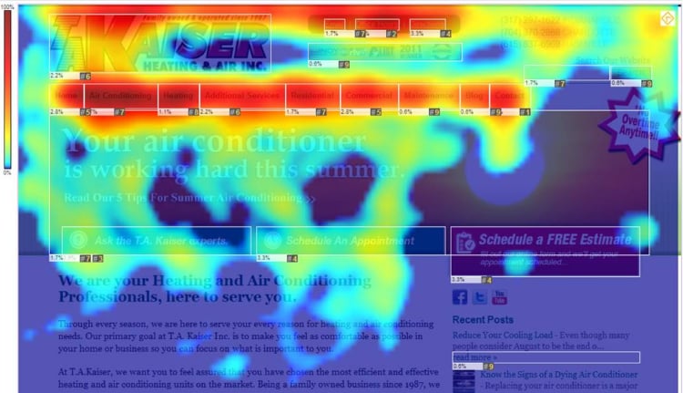
A marketing friend of mine, for instance, added heatmaps to see how he could improve the opt-in rates on his blog posts.
He noticed that a surprising amount of people click on the links right below images in articles.
So he started adding the most important links in the captions of his images — and his conversion rate increased!
Crazy Egg is a great tool for creating heatmaps and clickmaps. They offer a free trial, so you can test it out and see how it works.
10. Use The Hook, Story, Offer Format
If you’re not using the Hook, Story, Offer format on your website, you should be.
This format is a simple 3-part framework that’s designed to increase conversions by getting visitors emotionally invested in what you have to say.
Here’s how it works:
- Hook — The hook is designed to grab the visitor’s attention and get them interested in what you have to say.
- Story — The story is designed to establish a connection with the visitor by sharing something relatable that they can connect with on an emotional level.
- Offer — The offer is where you actually make your proposal. This is where you tell the visitor what you want them to do (buy your product, sign up for your email list, etc.)
We use this process all the time at ClickFunnels to make sales and convert visitors.
Let’s look at a quick example.
Hook — You hook the person with an irresistible headline that builds curiosity and makes them want to keep reading.
Story — Then you tell a story that relates to the challenges and struggles your target market is going through. You show them that you understand where they’re coming from.
Offer — Finally, you reveal the solution you discovered (your products or services) and offer it to the visitor for an irresistible deal.
That’s it.
You’ll notice this format repeated on almost all of our sales pages — because it works really well.
11. Build Follow-Up Funnels
No matter how good your sales funnel is, not everyone is going to convert on their first pass.
That’s why it’s important to have a follow-up funnel in place.
A follow-up funnel is a series of emails (or other messages) that are designed to build relationships with prospects who didn’t convert and eventually turn them into customers or clients.
The best way to do this is to set up an email autoresponder that sends out a series of messages over time to people who abandoned their cart.
Each message should be designed to bring the reader one step closer to becoming a customer.
For instance, you might start by sending them a freebie or discount code, then follow up with more detailed information about your products or services, and finally end with a strong call-to-action to buy your product or sign up for your service.
You can use ClickFunnels to automatically send out these messages over time.
And if you don’t already have an email sequence to turn new leads into paying customers, then we highly recommend that you build a Soap Opera Sequence.
Here’s a great video breaking down how that works…
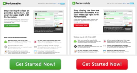
12. Use Contrasting Colors For CTAs
If you want people to click on your call-to-action buttons, then you need to make them stand out.
Why’s that important?
One of the key principles of conversion optimization is that you need to make it easy for people to take the action you want them to take.
If your CTA button is the same color as everything else on your page, then it’s not going to stand out and people might have a hard time finding it.
That’s why it’s important to use contrasting colors for your CTAs.
For instance, if your page is mostly white, then you might want to make your CTA button red or orange.
Or if your page is mostly black, then you might want to make your CTA button green or blue.
The key is to experiment and find what works best for your audience.
Sounds like it won’t make any difference?
In one famous study, Performable saw a 34% increase in conversions when they did nothing other than changing their CTA color from green to red.
Final Thoughts
There you have it — simple but effective ways to increase your website conversions.
Remember, the key is to constantly be testing different things to see what works best for your audience.
And if you want to make things even easier, then we highly recommend using ClickFunnels to build out your sales funnels.
It’s the easiest way to increase your conversions without having to hire a team of expensive developers and designers.
Click below if you want to learn why your website just isn’t cutting it anymore.
Here’s The Hard Truth Behind Your Website’s Sub-Par Performance