

Having just returned from the first ever Clickfunnels Design-a-thon, I’m greatly inspired to bring you some tiny design tweaks that make a BIG difference in the professionalism and style of your funnels.
One of the biggest takeaways from the event was to remember that in all things funnel, you want to focus on MACRO changes first if traffic isn’t converting. This means focusing on the OFFER, then the COPY, and then the AUDIENCE.
But assuming you’ve got those things in the bag and dialed in, here are some top tiny tips from 30 of the most talented funnel designers who just spent 2 days designing new funnels for the new Clickfunnels Marketplace coming soon. These are all super easy to implement, take about five seconds, and help fugly funnels look a whole lot better.
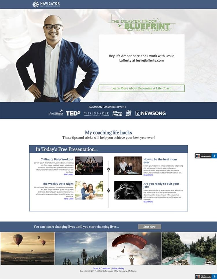
#1 Left Justified Non-Full Width Buttons
Everyone does centered buttons all the time. BORING. Instead, try placing a left-justified button underneath a headline and call to action, and make the button smaller than the width of a section. As Chris (one of the designers said in his most Australian voice) — “It’s just sexier.”
#2 Go Naked on the Subtitles
Bold is great for your big, amazing, high converting headlines. But on those tag lines underneath (sometimes called sub-headings), skip the bold and keep it clean. The contrast will help pull the reader in.
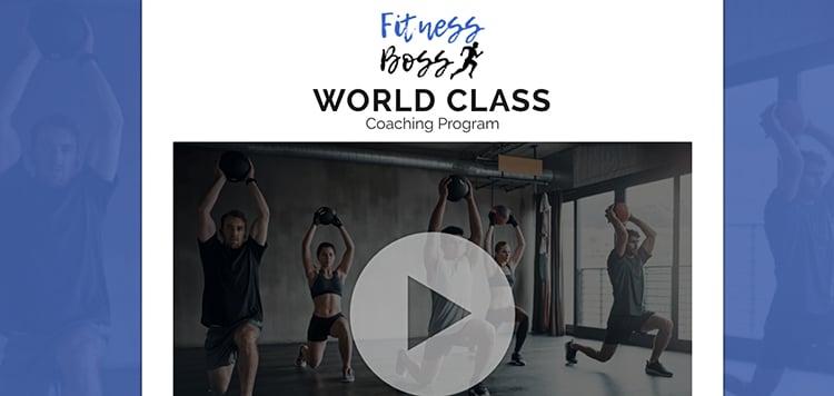
#3 Quotes
Did you know that when you have a paragraph of text, most people will skim (or not even read) the whole thing, but they WILL stop and read quotes? So if you have lines in your copy that you need to stand out, consider italicizing them, changing the font or the color to create contrast, and indent it if you can!
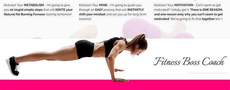
You can see BOTH the nice contrast on the tagline below the header, the left justified button, as well as the quote!
#4 Texture, Texture!
When you’re working with backgrounds, especially if white or light gray, you can go to a site like subtlepatterns.com and get some great free textures. These types of patterns are (as the name implies) super subtle, but add depth to the page that can’t be achieved with a simple color background.
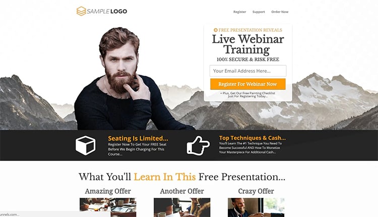
#5 Security Icons
You might not realize it, but when you look at a well-designed funnel step and are ready to buy off the page, it’s because you feel a sense of trust and authority. And subconsciously, your brain has been looking for those little signs as you read. So things like security lock icons, small italicized disclaimers and privacy policies, as well as the little credit card icons, all add to the sense of legitimacy. So look at your buttons and your footer and your guarantees and see what kind of small “design triggers” you can put on the page.
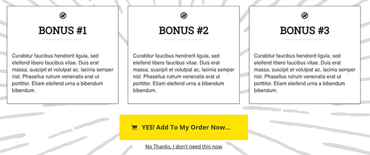
#6 White Column Boxes
A lot of people don’t realize that you can create custom column backgrounds within a blue section. If you go to the top of the Power Editor and click on COLUMNS > MANAGE COLUMNS, you’ll be able to add specific color or image backgrounds. There’s nothing nicer than a simple white box against a pale gray background. It adds a professional pop and is perfect for highlighting bonuses! One extra hint – Add a 10% dropshadow!

#7 Overlapping Overlays
When you look at high end websites, you might not realize that a slight overlap from section to section adds design pizazz that most amateurs can’t pull off. To do this, you may need to futz around with margins, but the simplest way is to create a background that’s set to Fill 100% Width and then add content in the blue section that takes up more vertical space than the background image allows. The content will drop over the edge and – bam, professional look without CSS!
#8 Go Small With Dividers
The divider element is a handy little element and now it’s got a setting so you can set it to fill only 25% of the width. Try adding super small dividers under sub-headlines to create a finishing touch that doesn’t seem significant, but is.
#9 Faded Images
Have a super cool photo? Try pulling it in Canva and adding a colored shape over the photo, and then drag down the transparency so just a bit of the photo shines through. It’s like adding a texture but with a more interesting background than just a pattern.
#10 Edge to Edge Collages
This takes a bit of Photoshop skills, but when photos go edge to edge on the browser, it just looks sexy. If you want to create an Instagram type collage, make a canvas in Photoshop about 2000 px wide and add your favorite photos and save it as one image. Then upload it as a background image in a green section and set it to Fill 100% width or Full Center Parallax.
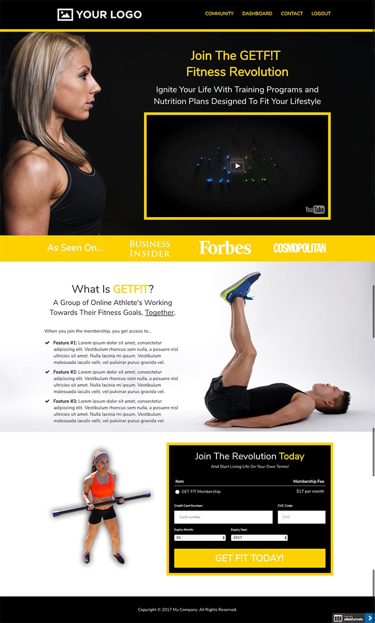
#11 Eyes Convert
Whenever you have a human face on a funnel page, see if you can’t first alter the image so that the gaze is looking straight at the Call to Action, or at the reader. We naturally look at peoples’ eyes and follow their line of sight, so a simple turn of the head or flipping a photo will up your conversion rate!
Go take a look at your funnels and see where you can add simple tweaks that add up to one big design upgrade! And one last thing…the new Clickfunnels Marketplace is launching soon, and with it – professional designs you can drop into your account and customize in minutes. It’s going to be so cool! I’ll keep updating this post with new design tweaks and inspiration.
Still having trouble? Don’t worry, we’ve got you covered. Learn how to set up your sales funnel in as little as 7 minutes with our Funnel Webclass!

Thanks for this very valuable piece of contents … It answers lots of my design driven questions I had around Sales Funnels. I totally agree with you on the white column boxes … which provided a by far more professional looking !
Thanks for your feedback! 🙂 It does really help.
Yet another great resource! I pressed print and having it ready for reference!
The textures resource is also really cool.
(And my funnels already perform very well in cost per result and click% From reach. This is great stuff to add! Thanks!)
Really great tips. I appreciate how much you share about the nuts and bolts, Julie.
Glad to do it! 🙂
Fab’ blog, as ever.. just goes to show that ALL parts of the marketing communication are capable of making a difference, big picture and detail need to work hard to maximise conversion. Thanks for capturing !
no problem!
Julie you are so good!!! I love your writing style… looking forward to reading many many more. Btw… I’m totally hiring your to write my bio!!
HA! Awesome!
Awesome stuff. We alway same the same for video. Eyes connect. People connect to eyes.
I loved this Julie, thanks for the tips!
Thanks so much! My funnels are so blocky – these are exactly the kind of tips I have been looking for! Thank you!
Hi Julie,
This is so helpful – thank you!
I have been trying to make an image overlap with the section below, but no matter how I size everything, the 'container' the image is in simply resizes to accommodate it – no 'flowing over'!
Where should I be adding the background image set to 100% Full Width – in the green section, the blue row or the column background?
Hey great tips! Does clickfunnels have a tutorial video on how to perform tip 7 with the overlays? I have been trying to find one with no luck. I think it would really help bring my site to life. Also would love to learn how to do diagonal overlays, the templates clickfunnels provide have them but I have no idea how to replicate it on my own pages.
Thank you.